
Dead Island 2
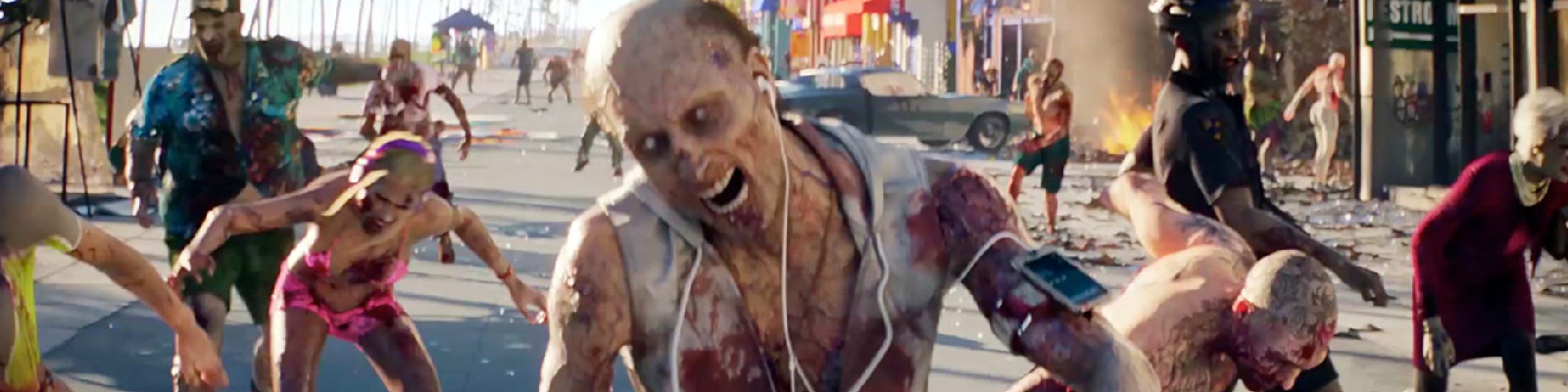
For the follow up to the popular Zombie first person shooter Dead Island, publisher Deep Silver took the storyline in a new direction. Dead Island 2 was to take place in California and wouldn’t be a traditional zombie survival game. The sequels storyline was that the zombie apocalypse had hit the sunshine state. Those who survived were embracing their new freedom and lifestyle.

As the creative director on the pitch, I decide to take the doom and gloom out of the creative and get my team thinking in a new direction.
Setting The Tone
Below is a proof of concept video we put together to set the tone for the creative.
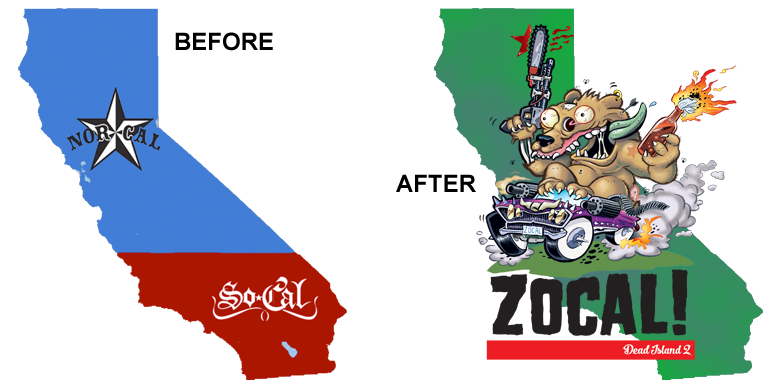
The core concept was to take the inter-state rivalry between Nor-Cal and So-Cal and use the zombie apocalypse to re-unite Cali. The post zombie apocalypse California attitude finally came together as ZOCAL.
With the ZOCAL creative concept set, the team and I went into production on everything from logo designs to key art looks.
Bringing The Concept To Life! (Or Death?)

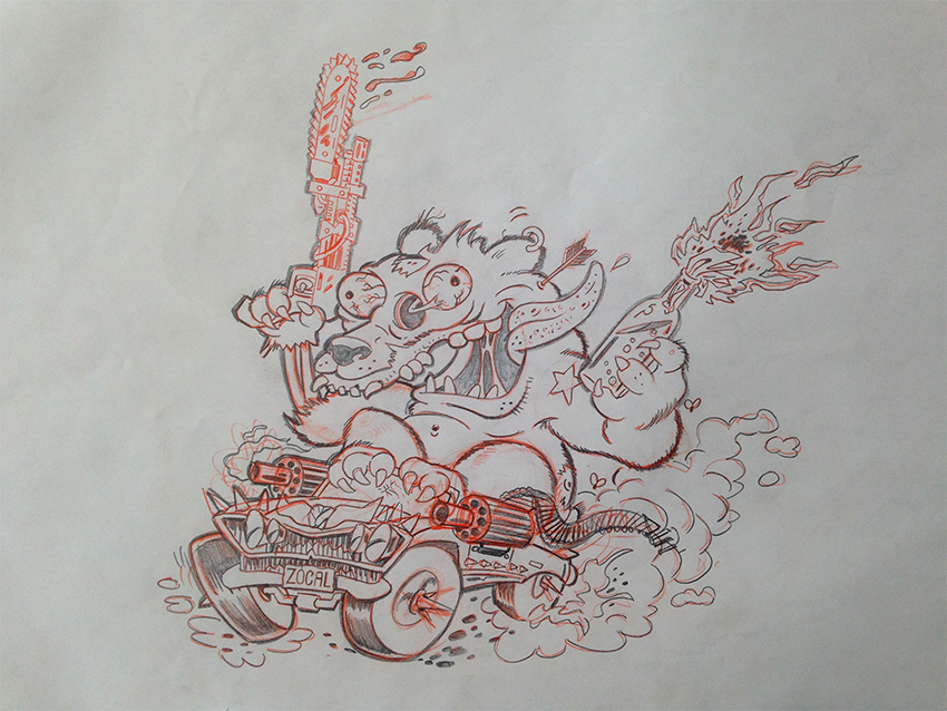
The above image is part of the logo exploration we did where we infused the California lifestyle with a zombie apocalypse attitude.

We wanted to present the logos as they might appear on apparel, so we took the approach to show them on an infected ZOCAL zombie. This was a theme throughout our pitch.
The most important part of our ZOCAL pitch was the key art exploration. Again my ask from the team was to approach the creative from a non-traditional zombie shooter and look into California’s rich history of art and design.

Art By Nathan Kane - Rough Draft 1

Art By Nathan Kane - Rough Draft 2
Art By Nathan Kane - Rough Draft 3

Concept and Design by myself and Illustrated by Nathan Kane.

This amazing rendition of a Peter Max inspired ZOCAL landscape is a perfect example of what I wanted to achieve with the embrace the California apocalypse attitude. This poster was the creative vision of Mike Gottschalk.
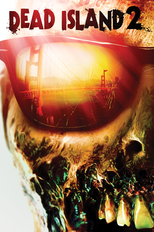
Another great piece of art from Hanzel Haro captures a sunglass-wearing zombie as he reflects the Golden Gate Bridge in his classic Ray-Bans. Whereas the previous posters were loved by the client, they felt this key art was the most consumer friendly and did the best job of a commercial version of my ZOCAL concept.

If SURFER Magazine were still publishing during the ZOCAL apocalypse, this key art would be an ideal cover, highlighting a surfer’s need to still get a set in, but make sure he’s ready to clear the beach before he hits the surf. Art and design by Hanzel Haro.
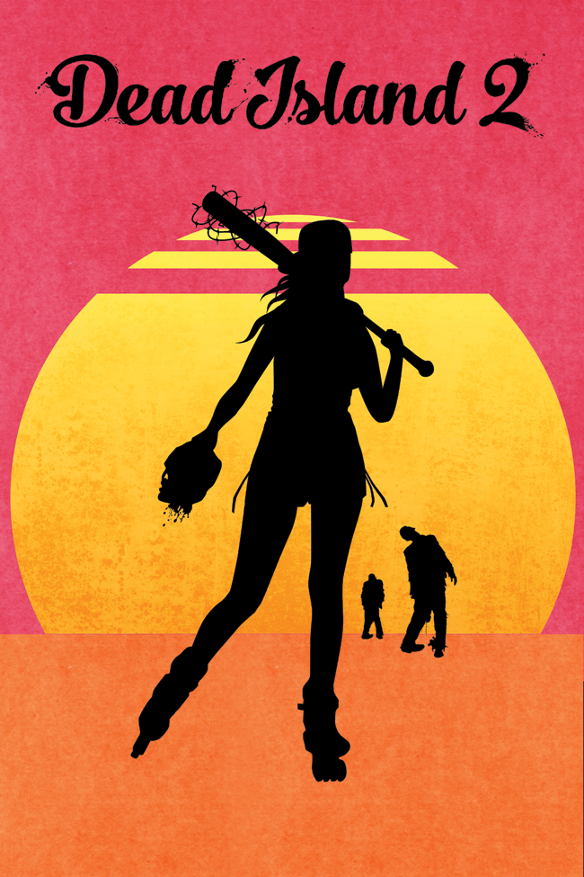
This Endless Summer inspired key art shows the arrogance of the don’t mess with my ZOCAL lifestyle. Our female hero gets her Venice Beach Boardwalk rollerblading in and doesn’t let the living dead slow her down. Designed by Hideo Igawa.

Welcome To ZOCAL!
Core Team:
Alan Hellard – Creative Director/Writer
Mitch Powers – Brand Strategist
Jonathon Clark – Producer/Writer
Mike Gottschalk – Associate Creative Director
Hanzel Haro – Art director
Hideo Igawa – Art Director